Archive for the ‘Usability’ Category
More fun with messages: Here be dragons!
July 6th, 2009
Earlier we looked at some examples of terribly ineffective Windows Mobile error messages; and now for something completely different.
Firefox uses a somewhat unconventional approach to ‘warning’ users when they’re about to do something potentially dangerous – take a look at these playful and humorous warning messages, displayed when you try to access the about:config settings:
(Ofcourse, there is no warranty to void on your freely downloaded software)
(And let’s hope there are no dragons! Image courtesy of @wandster)
I must admit that I prefer the ‘Dragons’ version (it seems to grab your attention more), but the nature of both messages do make you, as the user, really think about whether you have the skills and knowledge to proceed. A concise explanation about what can happen if you don’t know what you’re doing is also provided in the text below the heading, and the ‘I’ll be careful, I promise!’ button further drives the overall message home (that should you proceed, you’ll be doing something potentially risky).
While the colloquial language might put off some strict usability folks, and the Plain English campaign would most certainly not approve (the headings are not direct, unambiguous, or dare I say boring enough), I think they’re actually quite appropriate for the audience and the situation. If the goal is to make users think twice before messing with the inner workings of the system, then mission accomplished! And these warnings are probably much more effective than a classic, straightforward, boring old warning message – by injecting a little personality into the messages, users are much more likely to read and absorb them, and therefore make an informed decision.
Could these also be simple examples of persuasive design? They kind of represent ‘soft’ constraints – the user is not actually forbidden from proceeding, but the language and tone of voice has deliberately been designed to ensure that users evaluate their level of knowledge and skill before doing so.
What do you think?
Tags: Error messages, Firefox, Persuasive design, Usability, User interface design
Posted in Errors and Error Messages, Usability | Comments (1)
Usability job titles: What is it you do again?
June 29th, 2009
Russell Wilson recently posted results from a survey of UX/UI professionals, which asked them to rank their preferred job titles. The results showed that ‘User Experience’ was the most preferred prefix, and ‘Designer’ was the most preferred suffix. Russell also pointed out the ambiguity of the term ‘User Experience’, and questioned its longevity as a title term since it is so often misunderstood both within and outside the UX/UI profession.
I think it is interesting to look at what we as professionals think we should be called, but I think it would be even more interesting (and useful) to understand what titles those outside our field expect us to have. Who do they look to contact when they are seeking out our services? What job titles do they search for, and what titles most effectively communicate what we do?
After all, as people who specialize in making sure that products and services are consumable and meet the needs of those who use them, shouldn’t we also make sure that what we ourselves offer is easy to understand and consume? I personally think what we call ourselves is an important part of this, and probably deserves some research in its own right.
Tags: Job titles, Usability, User Experience
Posted in Usability | Comments (0)
Fun with Windows Mobile Error Messages
June 28th, 2009
Just before I started working at my current company, they decided to invest in smart phones for their consultants. A great idea, but unfortunately we all ended up with Windows Mobile devices which have pretty much been a nightmare from day one, and which we now refer to as ‘the brick’. While there are many problems with the phone from a usability and user experience point of view, I thought I’d share one of my favourite examples.
After dialing a number or choosing a contact that you’d like to call, sometimes the call fails for no apparent reason, and this message pops up onto the screen:
“Cannot connect. Ensure that your phone is turned on and correctly configured, and that service is available, before trying again.”
The message is unhelpful for so many reasons, especially the part that states “Ensure that your phone is turned on”. Ahem. If my phone wasn’t on, how would I be reading this message, exactly?
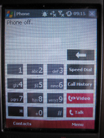
To make matters worse, if you switch to the phone display it shows the text “Phone off” at the top:
Hm. I’m pretty sure that the phone is on, unless this whole experience is a hallucination.
The first time I had this problem it took me ages to figure out what the messages were trying to tell me, and to figure out how to turn the phone ‘on’ even though as far as I could tell the phone was already on. Apparently the people who designed the UI had a different notion of what constituted the ‘phone’ versus the device itself – the device could be turned on while the phone function was turned off, and hence the ridiculously confusing error message.
This is a great example of how things can go terribly wrong when the designers’ mental models, or ideas about how something works, do not match the user’s. It is also a great example of a significant usability issue that could have (and should have!) been detected well before the device went to market, if sufficient user research and testing had been conducted.
Tags: Error messages, Usability, User interface design
Posted in Errors and Error Messages, Mobile, Usability | Comments (3)
Amazon’s Kindle: A case for accessible design
May 17th, 2009
Accessible design (also known as universal or inclusive design), is all about designing your products and services so they can be accessed and used by as wide an audience as possible, regardless of age, disability, or other limiting factors. It’s not about designing for a specific disability group, rather it is about making sure that mainstream products can still reach the growing number of people without perfect vision, hearing, mobility, or cognition.
Accessible design is more than just a social phenomenon – as the balance of the population continues to tip towards the elderly, it is increasingly being seen as a commercial opportunity. Those at the older end of the population pyramid often do not have the same levels of dexterity or eyesight as their younger counterparts, although they do have considerably more disposable income. Products that are designed to also meet the needs of this rapidly growing user group therefore have the potential to appeal to a considerably larger market.
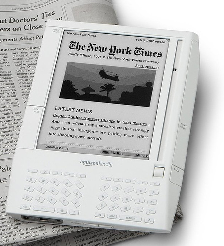
An interesting yet unexpected example of this came to light recently, when discussions on an Amazon forum led to the revelation that over 50% of Amazon Kindle owners are 50+, and nearly 70% are 40+. So why does the Kindle appeal so much to this older audience? Take a look at this quote from a Publishers Lunch report based on the same forum:
“So many users said they like Kindle because they suffer from some form of arthritis that multiple posters indicate that they do or do not have arthritis as a matter of course. A variety of other impairments, from weakening eyes and carpal-tunnel-like syndromes to more exotic disabilities dominate the purchase rationales of these posters.”
For those with arthritic hands, the form factor of the Kindle makes it easier to hold and easier to page through than heavy hardcovers and flimsy paperbacks. The display also offers several advantages. It uses an electronic ink that is similar to print, so it is crisp and clear. For those with ageing eyes, the text size is also customizable – providing obvious advantages over paper equivalents (this is also an important feature for those with dyslexia). As one legally blind Kindle owner explains, the text-to-speech functionality is also a very important accessibility feature – while the computerized voices are no competition for audio books, they are still progress towards making text more generally available to the visually impaired.
Of course, the Kindle doesn’t have it all figured out (for example, see some additional accessibility requests from Russ Stinehour). But it certainly is a great example of how taking an inclusive approach to the design of a mainstream product can benefit your users and customers in unexpected ways, and how it can also help you to reach a much broader and more lucrative market.
Tags: Accessibility, Accessible design, Inclusive design, Universal design
Posted in Design, Usability | Comments (0)
The importance of setting sensible defaults
May 3rd, 2009
Or, when did ordering tea become so complex?
Have you ever tried to accomplish what you expected to be a straightforward task, but been sidelined because there were too many steps or too many choices to make? This is a common problem in web and software design, but you have probably also come across it in many other day-to-day tasks. For example, this is what happened to me when I tried to order a tea at Starbucks recently:
Me: Hi, can I have a medium tea for take-away?
Starbucks Guy: Ok, one tea. What size would you like?
Me: Medium, please
Starbucks Guy: One medium tea. To drink in, or to take away?
Me: To take away please
Starbucks Guy: Ok
[Starbucks Guy turns around and walks over to the tea bags]
Starbucks Guy [calling over his shoulder]: Would you like one tea bag or two?
Me [yelling back to him over the general coffee shop noise]: One is fine!
Starbucks Guy [still calling over his shoulder]: Is English Breakfast ok?
Me: Yes! English Breakfast!
Starbucks Guy [now standing by the hot water spout]: Would you like room for milk?
Me: Yes, please
Starbucks Guy [now standing back at the counter]: Warm milk, or cold milk?
Me: Cold milk is fine
Starbucks Guy: Ok, cold milk is on the counter next to the napkins
[Starbucks Guy finally hands me my boring old standard cup of tea, so I can go add my boring old regular milk]
In this situation, I asked for a medium tea for take-away, thinking that would be more than enough information for the cashier to prepare my order. I didn’t want anything out of the ordinary, yet he still had to ask me SIX questions before the order was complete; two of the questions repeated information I had already provided, and none involved up-selling.
Now, I understand that one of Starbucks’ defining features is that it allows each customer to personalise their order to fit their unique tastes. But when carrying out common procedres like placing a tea order or installing a new software product, there is likely to be a large portion of the population who want or need basically the same thing, and a smaller portion of the population who want or need something dramatically different. This is why, in user interface design, we try to define sensible ‘default settings’ whenever possible – it makes life easier for the majority of users, and makes processes more efficient.
In the world of software, a default or preset is an initial value that is assigned to a configurable option. Likewise, default options often exist in the physical world; for the configurable option of ‘number of tea bags’, most cafés have a default value of ‘one’. The goal is to identify the values that will meet the needs of most users or customers, so the majority of people don’t have to bother thinking about what the ‘right’ answer is.**
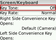
For example, on my Blackberry Pearl, the default setting for the ‘Key Tone’ (the sound that is made when you press a key) is ‘Off’ – most users don’t want to hear a beep every time they press a button on their phone, so they will simply accept this perfectly reasonable default setting. However, for those who need more feedback that a key has been pressed (such as people with vision impairments), they can change the setting to meet their needs:
How can we extend this notion to other real-world processes, like filling a drink order? Simple.
- For each drink type (tea, café latte, cappuccino, etc) collect some data on what people order and what options they choose (size, milk type, topping, etc)
- Identify the most common configurations
- Establish those common configurations as the ‘defaults’
- Allow your customers to indicate any special requests up front, but don’t force them to reiterate the standard options unnecessarily.
Of course, you can’t set default values for everything. For example, you couldn’t set the default drink type to ‘tea’ at Starbucks – there are some choices that customers just have to specify, and defaults are only useful if they are carefully chosen to cover the majority of cases. But whether you’re designing the process behind a web application, a mobile phone, or a face-to-face interaction, think carefully about the defaults so you can optimise the end user experience.
** Note: I am not advocating for designing for the ‘average user’ here. I am suggesting that if you have decided that there is value in making something customisable, you should still make every effort to minimise the need for users to interact with that configuration.
Tags: Efficiency, Optimisation, Process design, Service Design, User interface design
Posted in Usability | Comments (0)
Keeping up, as the world goes mobile
April 26th, 2009
How does your website perform when accessed from a mobile?
Have you ever used your mobile to check the score for the football game you missed, because you were stuck on the train? Or used it to look up the address of that store you were certain was on Oxford Street, but just couldn’t find when you got there? Well, a recent article in The Independent suggests that you’re not alone; twenty five percent of British mobile phone users currently access the web from their mobiles at least once a month, and an estimated 1.2 billion people will regularly use their mobile phones to access the web by 2012.
What does this mean for businesses who currently provide websites and web-based services optimised for desktop browsing rather than mobile users?
Some of the issues
- Your website may provide a poor user experience when accessed by a mobile browser, it or may not work at all. As mobile web use increases, it will be those businesses who offer usable, useful, and satisfying mobile web experiences that will be perceived as innovators and leaders by the web-savvy market.
- You may be missing out on new potential revenue streams. The Independent reported that London has become the core for mobile start-ups, even surpassing Silicon Valley thanks to lower mobile tariffs and an abundance of talented people. The same article notes that major Venture Capitalists value mobile users in their business models at up to six times higher than ‘traditional’ web users.
- You may risk losing customers to competitors who have used their mobile web experience as a differentiator for their services, particularly in highly competitive markets. Personal Banking is an example of an industry where offering best-of-breed mobile services might be a compelling reason for customers to switch.
The way forward
So what can you do now to start building a mobile relationship with your customers, and to make sure you stay ahead of your competitors in the mobile space? Here are a couple of ideas:
First, make sure that your website meets your customers’ real needs when they access it from their mobile phone, and offers a usable, useful, and satisfying experience. You can focus your design and development efforts by:
- researching what users expect from your website when they are mobile
- identifying and documenting the most important tasks for your mobile users
- testing to make sure new designs allow users to perform those tasks
- reviewing your website using different mobile phone browsers to identify high-level issues.
You can also look for innovative ways to engage your customers in this new mobile-oriented world, and stand out from your competitors. In order to stimulate and direct your creativity towards a successful product, consider activities such as:
- conducting creative user research including cultural probes, focus groups, and participatory design techniques to help you understand what is important to your users today, and to help you explore new mobile revenue streams for the future
- making your product development process user centred, to ensure your creative ideas develop into a product which is effective, efficient and satisfying to use.
So, what next?
If you’d like some help improving your mobile presence, feel free to contact me.
Tags: Design, Mobile, Usability, User Experience, User research
Posted in Mobile, Usability | Comments (0)


