Posts Tagged ‘User interface design’
More fun with messages: Here be dragons!
July 6th, 2009
Earlier we looked at some examples of terribly ineffective Windows Mobile error messages; and now for something completely different.
Firefox uses a somewhat unconventional approach to ‘warning’ users when they’re about to do something potentially dangerous – take a look at these playful and humorous warning messages, displayed when you try to access the about:config settings:
(Ofcourse, there is no warranty to void on your freely downloaded software)
(And let’s hope there are no dragons! Image courtesy of @wandster)
I must admit that I prefer the ‘Dragons’ version (it seems to grab your attention more), but the nature of both messages do make you, as the user, really think about whether you have the skills and knowledge to proceed. A concise explanation about what can happen if you don’t know what you’re doing is also provided in the text below the heading, and the ‘I’ll be careful, I promise!’ button further drives the overall message home (that should you proceed, you’ll be doing something potentially risky).
While the colloquial language might put off some strict usability folks, and the Plain English campaign would most certainly not approve (the headings are not direct, unambiguous, or dare I say boring enough), I think they’re actually quite appropriate for the audience and the situation. If the goal is to make users think twice before messing with the inner workings of the system, then mission accomplished! And these warnings are probably much more effective than a classic, straightforward, boring old warning message – by injecting a little personality into the messages, users are much more likely to read and absorb them, and therefore make an informed decision.
Could these also be simple examples of persuasive design? They kind of represent ‘soft’ constraints – the user is not actually forbidden from proceeding, but the language and tone of voice has deliberately been designed to ensure that users evaluate their level of knowledge and skill before doing so.
What do you think?
Tags: Error messages, Firefox, Persuasive design, Usability, User interface design
Posted in Errors and Error Messages, Usability | Comments (1)
Fun with Windows Mobile Error Messages
June 28th, 2009
Just before I started working at my current company, they decided to invest in smart phones for their consultants. A great idea, but unfortunately we all ended up with Windows Mobile devices which have pretty much been a nightmare from day one, and which we now refer to as ‘the brick’. While there are many problems with the phone from a usability and user experience point of view, I thought I’d share one of my favourite examples.
After dialing a number or choosing a contact that you’d like to call, sometimes the call fails for no apparent reason, and this message pops up onto the screen:
“Cannot connect. Ensure that your phone is turned on and correctly configured, and that service is available, before trying again.”
The message is unhelpful for so many reasons, especially the part that states “Ensure that your phone is turned on”. Ahem. If my phone wasn’t on, how would I be reading this message, exactly?
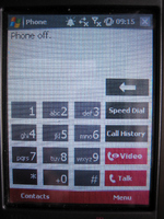
To make matters worse, if you switch to the phone display it shows the text “Phone off” at the top:
Hm. I’m pretty sure that the phone is on, unless this whole experience is a hallucination.
The first time I had this problem it took me ages to figure out what the messages were trying to tell me, and to figure out how to turn the phone ‘on’ even though as far as I could tell the phone was already on. Apparently the people who designed the UI had a different notion of what constituted the ‘phone’ versus the device itself – the device could be turned on while the phone function was turned off, and hence the ridiculously confusing error message.
This is a great example of how things can go terribly wrong when the designers’ mental models, or ideas about how something works, do not match the user’s. It is also a great example of a significant usability issue that could have (and should have!) been detected well before the device went to market, if sufficient user research and testing had been conducted.
Tags: Error messages, Usability, User interface design
Posted in Errors and Error Messages, Mobile, Usability | Comments (3)
Axure for wireframes and interactive mockups?
May 9th, 2009
One of the companies I do user-centred design for invited me to join in on an informal demo of Axure this week, a tool for wireframing, building prototypes, and creating design specifications. The person leading the demo had been using a trial version of the software for about a month, and was so excited about it she was trying to convince her company to buy some licenses.
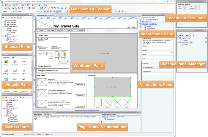
Here’s a screenshot of the tool:
Although I’ve never used Axure myself, I wanted to share a few thoughts I had based on the demo. Currently, I use Microsoft Visio to do most of my wireframing (low-fidelity and medium-fidelity), and when I need to show interaction (eg for user testing, presenting ideas to the project team, or demoing end-to-end scenarios) I’ve been using Microsoft Expressions Web to turn the designs into all-singing, all-dancing prototypes. I’ve been really happy with this process, and have found that the combination of Visio and Expressions has certainly been meeting my needs. But the woman who demoed Axure was so excited (after only a trial!), that I’m somewhat intrigued.
Based on the demo, I gather that some of the strengths of Axure are:
- Useful for quickly communicating and evaluating ideas that are tied to interaction
- Useful for documenting agreed designs, including the behaviour of each control/widget
- Useful for incrementally building up and documenting a design base (especially good for long term, iterative design projects)
- May be quicker (eg than MS Expressions) to create interactive mockups, such as those for user tests and demos?
However, the demo also left me wondering about a few things:
- It was not clear how well Axure serves as a primary design tool (eg in place of Visio), as it was not immediately obvious how well it facilitates ‘design exploration’ – in which case, base initial designs may still have to be roughly defined and agreed in a separate tool (eg Visio) before being moved over to Axure.
- Because of its focus on interactivity, I have some concerns that it may encourage defining detailed interactions too soon in the design process.
I’m considering downloading a trial version to play around with, its just a matter of finding some ‘free’ time. In the meantime, I’m curious if any of you have used Axure? I’d love to hear about your experiences with it, or with other similar tools!
Tags: Design tools, Interaction design, User interface design
Posted in Design | Comments (0)
The importance of setting sensible defaults
May 3rd, 2009
Or, when did ordering tea become so complex?
Have you ever tried to accomplish what you expected to be a straightforward task, but been sidelined because there were too many steps or too many choices to make? This is a common problem in web and software design, but you have probably also come across it in many other day-to-day tasks. For example, this is what happened to me when I tried to order a tea at Starbucks recently:
Me: Hi, can I have a medium tea for take-away?
Starbucks Guy: Ok, one tea. What size would you like?
Me: Medium, please
Starbucks Guy: One medium tea. To drink in, or to take away?
Me: To take away please
Starbucks Guy: Ok
[Starbucks Guy turns around and walks over to the tea bags]
Starbucks Guy [calling over his shoulder]: Would you like one tea bag or two?
Me [yelling back to him over the general coffee shop noise]: One is fine!
Starbucks Guy [still calling over his shoulder]: Is English Breakfast ok?
Me: Yes! English Breakfast!
Starbucks Guy [now standing by the hot water spout]: Would you like room for milk?
Me: Yes, please
Starbucks Guy [now standing back at the counter]: Warm milk, or cold milk?
Me: Cold milk is fine
Starbucks Guy: Ok, cold milk is on the counter next to the napkins
[Starbucks Guy finally hands me my boring old standard cup of tea, so I can go add my boring old regular milk]
In this situation, I asked for a medium tea for take-away, thinking that would be more than enough information for the cashier to prepare my order. I didn’t want anything out of the ordinary, yet he still had to ask me SIX questions before the order was complete; two of the questions repeated information I had already provided, and none involved up-selling.
Now, I understand that one of Starbucks’ defining features is that it allows each customer to personalise their order to fit their unique tastes. But when carrying out common procedres like placing a tea order or installing a new software product, there is likely to be a large portion of the population who want or need basically the same thing, and a smaller portion of the population who want or need something dramatically different. This is why, in user interface design, we try to define sensible ‘default settings’ whenever possible – it makes life easier for the majority of users, and makes processes more efficient.
In the world of software, a default or preset is an initial value that is assigned to a configurable option. Likewise, default options often exist in the physical world; for the configurable option of ‘number of tea bags’, most cafés have a default value of ‘one’. The goal is to identify the values that will meet the needs of most users or customers, so the majority of people don’t have to bother thinking about what the ‘right’ answer is.**
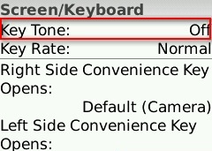
For example, on my Blackberry Pearl, the default setting for the ‘Key Tone’ (the sound that is made when you press a key) is ‘Off’ – most users don’t want to hear a beep every time they press a button on their phone, so they will simply accept this perfectly reasonable default setting. However, for those who need more feedback that a key has been pressed (such as people with vision impairments), they can change the setting to meet their needs:
How can we extend this notion to other real-world processes, like filling a drink order? Simple.
- For each drink type (tea, café latte, cappuccino, etc) collect some data on what people order and what options they choose (size, milk type, topping, etc)
- Identify the most common configurations
- Establish those common configurations as the ‘defaults’
- Allow your customers to indicate any special requests up front, but don’t force them to reiterate the standard options unnecessarily.
Of course, you can’t set default values for everything. For example, you couldn’t set the default drink type to ‘tea’ at Starbucks – there are some choices that customers just have to specify, and defaults are only useful if they are carefully chosen to cover the majority of cases. But whether you’re designing the process behind a web application, a mobile phone, or a face-to-face interaction, think carefully about the defaults so you can optimise the end user experience.
** Note: I am not advocating for designing for the ‘average user’ here. I am suggesting that if you have decided that there is value in making something customisable, you should still make every effort to minimise the need for users to interact with that configuration.
Tags: Efficiency, Optimisation, Process design, Service Design, User interface design
Posted in Usability | Comments (0)


